Hi, I’m Vian Wrya — an Illustrator
rooted in Mississauga, ON!
I’m a Canadian-based children’s book illustrator who creates pieces that resonate with both kids and parents. My work focuses on warmth, familiarity, and storytelling pulled from everyday life. I’m looking to collaborate with art directors and publishers who value heartfelt narratives, strong visual direction, and illustrations that feel personal and memorable.
Short Comic: Life is Good
A one-page comic illustrated in a storybook style, following a baby orangutan who finds joy in every moment.Life Is Good is a short, single-page comic about a baby orangutan who moves through life with a carefree spirit, choosing to see the good in every situation. A gentle reminder that even when things aren’t perfect, life can still be good!
Greetings From The Garden
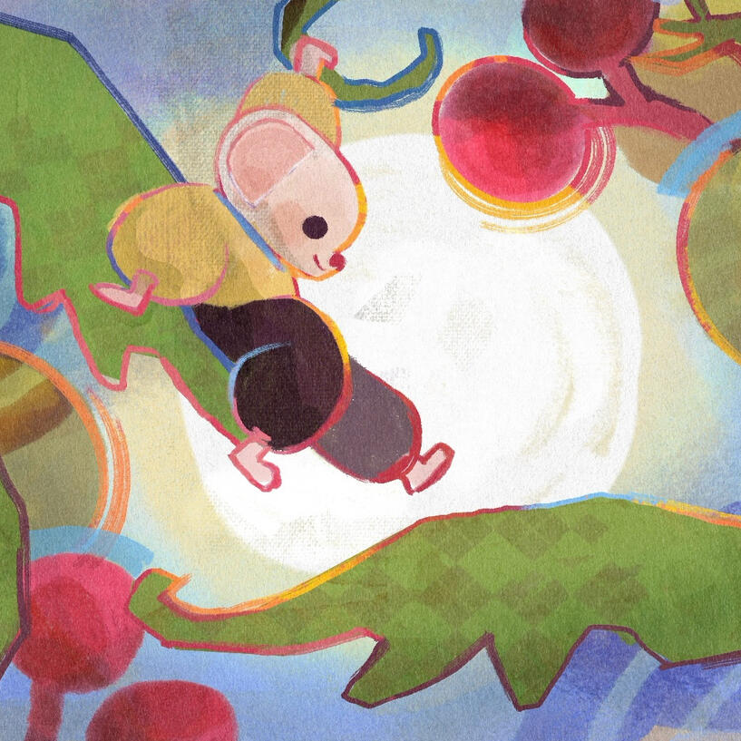
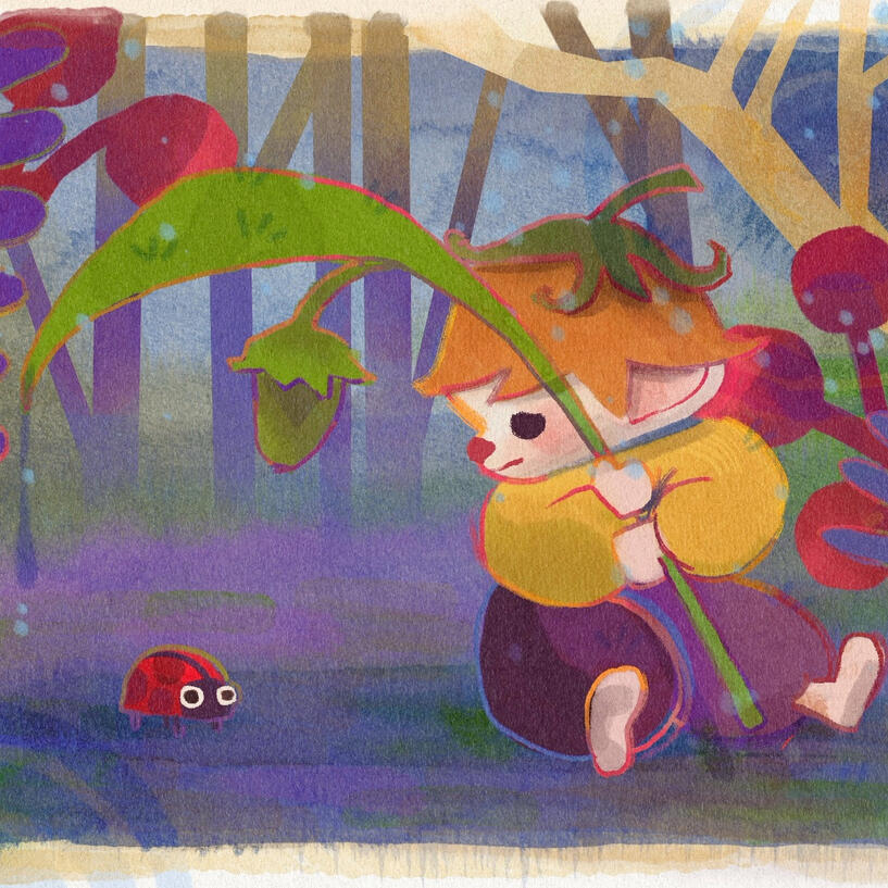
A fun and whimsical 3-part postcard series capturing the warmth of home and the wonder of small discoveries. Designed to feel commercially real while conceptually telling a heartfelt story.Greetings from the Garden is a three-part illustrated postcard series created for an Illustrative Narrative project, where the goal was to tell a complete story through just three postcards. Drawing from my own feelings of homesickness after moving away and nearing the end of college, I imagined a small mouse exploring a familiar garden that feels vast and new.
Short Comic: Out of Sight, Out of Mind
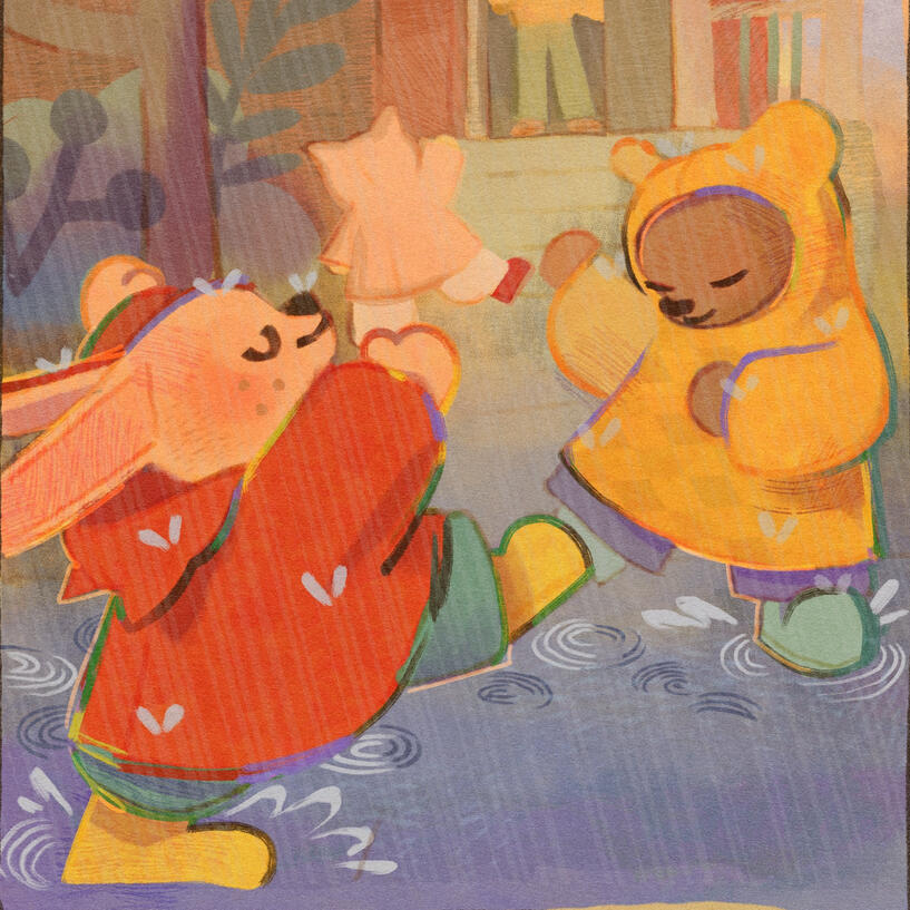
A three-page comic that captures the quiet moment where memory and wonder meet again.Out of Sight, Out of Mind is a narrative comic inspired by the saying of the same name, exploring how moments once forgotten can return to us in unexpected ways. It’s a tender reminder that joy isn’t something we outgrow; it only waits for us to notice it again, like rain that once felt as vast as the ocean.
The Ant-Eater
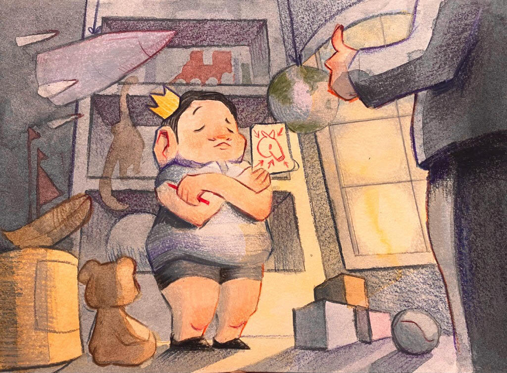
For a college illustration project, I chose to reimagine a Roald Dahl story. Though originally a children's tale, I decided to take a creative turn and infuse it with elements of horror, making it more suited for an adult audience.The process of designing the characters was a blast—I loved exploring ways to convey as much of the narrative as possible within just four sequential images.
Illustrated by Vian Wrya
Written by Roald DahlSome wealthy folks from U.S.A.,
Who lived near San Francisco Bay,
Possessed an only child called Roy,
A plump and unattractive boy –
Half-baked, half-witted and half-boiled,
But worst of all, most dreadfully spoiled.
Whatever Roy desired each day,
His father bought him right away –
Toy motorcars, electric trains,
The latest model aeroplanes,
A colour television-set,
A saxophone, a clarinet,
Expensive teddy-bears that talked,
And animals that walked and squawked.
That house contained sufficient toys
To thrill a half a million boys.
(As well as this, young Roy would choose,
Two pairs a week of brand-new shoes.)
And now he stood there shouting, “What
“On earth is there I haven’t got?
“How hard to think of something new!
“The choices are extremely few!”
“Then added, as he scratched his ear,
“Hold it! I’ve got a good idea!
“I think the next thing I must get
“Should be a most peculiar pet –
“The kind that no one else has got –
“A giant ANT-EATER! Why not?”
As soon as father heard the news,
He quickly wrote to all the zoos.
“Dear Sirs,” he said, “My dear keepers,
“Do any of you have ant-eaters?”
They answered by return of mail.
“Our ant-eaters are not for sale.”
Undaunted, Roy’s fond parent hurled
More messages around the world.
He said, “I’ll pay you through the nose
“If you can get me one of those.”
At last he found an Indian gent
(He lived near Delhi, in a tent),
Who said that he would sacrifice
His pet for an enormous price
(The price demanded, if you please,
Was fifty thousand gold rupees).”
The ant-eater arrived half-dead.
It looked at Roy and softly said,
“I’m famished. Do you think you could
“Please give me just a little food?
“A crust of bread, a bit of meat?
“I haven’t had anything to eat
“In all the time I was at sea,
“For nobody looked after me,”
Roy shouted, “No! No bread or meat!
“Go find some ants! They’re what you eat!”
The starving creature crawled away.
It searched the garden night and day,
It hunted every inch of ground,
But not one single ant it found,
“Please give me food!” the creature cried.
“Go find an ant!” the boy replied.
By chance, upon that very day,
Roy’s father’s sister came to stay –
A foul old hag of eighty-three
Whose name, it seems, was Dorothy.
She said to Roy, “Come let us sit
“Out in the sun and talk a bit,”
Roy said, “I don’t believe you’ve met
“My new and most unusual pet?”
He pointed down among the stones
Where something lay, all skin and bones.
“Ant-eater!” He yelled. “Don’t lie there yawning!
“This is my ant! Come say good-morning!””
(Some people in the U.S.A.
Have trouble with the words they say.
However hard they try, they can’t
Pronounce simple words like AUNT.
Instead of AUNT, they call it ANT,
Instead of CAN’T, they call it KANT.)
Roy yelled, “Come here, you so and so!
“My ant would like to say hello!”
Slowly, the creature raised its head.
“D’you mean that that’s an ant?” it said.
“Of course!” cried Roy. “Ant Dorothy!
“This ant is over eighty-three.”
The creature smiled. Its tummy rumbled.
It licked its starving lips and mumbled,
“A giant ant! By gosh, a winner!
“At last I’ll get a decent dinner!
“No matter if it’s eighty-three.
“If that’s an ant, then it’s for me!”
Then, taking very careful aim,
It pounced upon the startled dame.
It grabbed her firmly by the hair
And ate her up right then and there,
Murmuring as it chewed the feet,
“The largest ant I’ll ever eat.”
Meanwhile, our hero Roy had sped
In terror to the potting-shed.
And tried to make himself obscure
Behind a pile of horse-manure.
But ant-eater came sneaking in
(Already it was much less thin)
And said to Roy, “You little squirt,
“I think I’ll have you for dessert.”
The End.
Granny’s Sweet Orange Marmalade: A Wordless Step-By-Step Recipe Booklet.
For a college information-illustration project, I was tasked with creating a step-by-step instructional guide for a process of my choice—with two key constraints: the guide could include no text, and it had to be completed in seven steps or fewer. Kind of like those instructional guides you get with your Ikea furniture!I decided to go with one of the simpler recipes from my personal cookbook as my subject. Conveying a process visually without relying on words presented an exciting challenge, allowing me to lean fully into my strengths as an illustrator. This project was a delightful exercise in clarity, creativity, and storytelling through imagery alone.
Hot Cocoa From Around The World: An Infographic
I created a nostalgic, cozy, and educational infographic exploring traditional hot cocoas from around the world—this project was an absolute joy to work on!The process involved deep cultural research, experimenting with recipes, and meticulously documenting flavour profiles, cooking techniques, and preparation methods.The infographic is divided into six thoughtful categories:
1. Flavor Profiles – Is it spicy, umami, salty, or bitter?
2. Preparation & Cooking Time – How long does each recipe take from start to finish?
3. Sweetness Level – From subtly sweet to rich and sugary.
4. Viscosity Level – How thick or creamy is the drink? (I personally love a thick, velvety hot cocoa!)
5. Country of Origin – Where does this traditional recipe come from?
6. Perfect Pairings – What snacks or dishes complement each hot cocoa?Creating this piece was both fun and educational, and I hope you enjoy diving into the world of hot cocoas as much as I did.
Jaboloo: A Folk Music Festival
In my third year of Sheridan College’s Bachelor of Illustration program, I took a dynamic course centered around the fundamentals of graphic design. One of the key projects in this course involved creating a fictional music festival and developing a complete branding package for it. This project allowed me to explore various aspects of design, including logo creation, typography, color palettes, and promotional materials, all while honing my ability to craft a cohesive visual identity. It was a fantastic learning experience that pushed my creative boundaries and gave me valuable insight into the world of branding and marketing design.To showcase my work, I’ve compiled a detailed slideshow case study for this music festival project. Take a look and explore the process behind the branding!
Canned Beer Labels
For a college project, I was assigned the task of designing two distinct beer labels for different products within the same line. On the left, you’ll see the design for “Campfire IPA,” and on the right, the label for “Log Rider Cider.” Both labels were created to align with the same overall brand identity while showcasing the unique characteristics of each beverage.This project was a valuable exercise in maintaining brand consistency across different products, ensuring legibility in a visually competitive market, and designing in a way that captures the attention of the target audience. It challenged me to balance creativity with functionality, delivering labels that are not only eye-catching but also communicate the essence of each product effectively.
Graphic Design for Sheridan College Clubs
As an executive of Sheridan College’s Zine Club, I took on a leading role in managing the club’s graphic design needs, volunteering to handle the majority of the creative work. This included designing eye-catching promotional posters, crafting engaging Instagram posts to boost our online presence, and developing versatile templates for various club projects. My contributions played a significant part in enhancing the club’s visibility, fostering community engagement, and ensuring our branding remained professional across all platforms.Through this role, I was able to combine my passion for design with my commitment to supporting and growing our creative community.
Stamped & Forgotten: A Collector’s Postage Stamp Booklet
A conceptual stamp collection that revives the beauty of tangible media and the fading art of handwritten communication.Stamped & Forgotten is a conceptual illustration project that reflects on the quiet disappearance of tangible media and the nostalgia it leaves behind. Designed as a Collector’s Postage Stamp Booklet for Canada Post, the project includes a front and back cover, an inner description page, and six limited-edition permanent stamps. Each stamp serves as both a tribute to and a vessel for lost physical formats—film, vinyl, print—and the meaningful experiences they once shaped. The very act of using a postage stamp becomes part of the message, reviving a fading form of tangible communication through something inherently tactile and personal. With its collage-inspired aesthetic, Stamped & Forgotten encourages viewers to reconnect with the physical world, celebrating the beauty found in what can be touched, held, and shared by hand.

